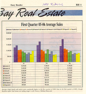
Easy Reader First Quarter 05-06 Average Sales

When on the verge of change in trend, unfortunately the mechanisms that report data are geared to show that data in the best light possible and that has the effect of keeping the deception going that the bullish trend is still in place. The Easy Reader published the chart above in the May 4, 2006 print edition. The paper insists on publishing a chart of average sales price, which I hope by now bubble blog readers know is a sham.
Take, for example, the lighter blue bars (between the green and the red bars), which represent 90278 in 2005 versus 2006. January, February, and March all report higher average sales price in 90278. However, our chart of total real estate $$$ transacted for 90278 in Q1 shows a clear slump.

If you read the microscopic 2 point font fine print on the Easy Reader chart, it says something like oh yeah, by the way, homes are taking longer to sell.


0 Comments:
Post a Comment
<< Home